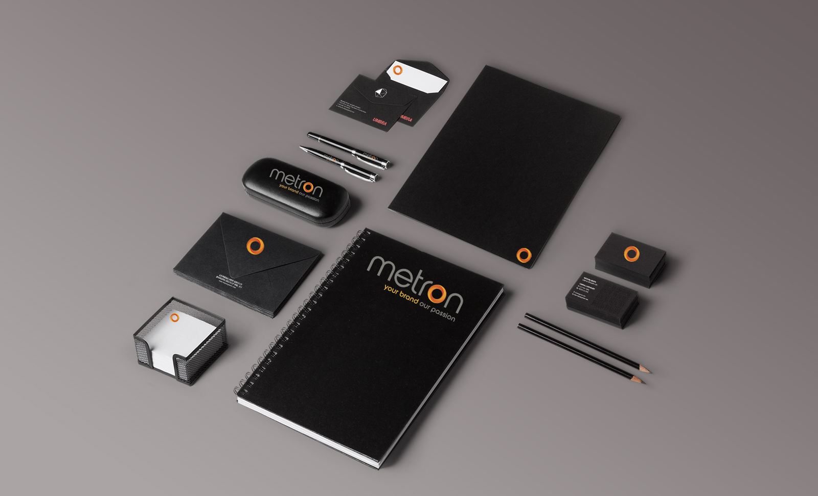
Organizations often put a lot of effort into their logo and website designs. However, many organizations tend to lose focus when it comes to their collateral, outsourcing it to any team member with enough time to crank out a Word document. The professionalism of your collateral can either strengthen or weaken your brand image. If you have several people creating collateral without any documented brand guidelines you risk the possibility of a mismatched library of collateral that will create a fragmented brand experience for your customer.
Working with your designer to develop a set of brand guidelines or collateral templates can help give your team clear parameters for when they need to create collateral for your organization. Here are a few core brand elements you might wish to consider documenting in your brand guidelines:
Core Brand Typefaces
Fonts are a subtle, but powerful, way to communicate the personality of your organization. Your designer likely put a lot of thought into the type selections they made for your logo and website designs, and it will help your collateral materials to retain the same spirit of your logo and website if you keep using these font selections consistently. Using your fonts in a similar way will help reinforce brand consistency even more—for example, if your website uses bold caps for headlines, you would want to continue that convention on your collateral).
Signature Brand Colors
Color is one of the quickest ways to communicate a feeling or emotion. Because of this, staying true to your brand colors throughout all of your collateral is one of the simplest ways to maintain your brand image. Make sure to document the PMS, CMYK and RGB color formulas and you’ll never accidentally use the wrong color again. Similar to your typefaces, using color in a similar way across materials is also important—for example, if your website uses navy blue type when a light gray background is present you may wish to continue this convention.
Icon, Illustration or Photography Styles
While it is true that a picture IS worth a thousand words, if you choose the wrong picture you risk saying the wrong thing. With the ubiquity of cheap stock photography, it is tempting to go crazy with images, but unless you are choosing an image that is on-brand and actually adds to the message at hand it can simply come off as cheesy and distracting. Make sure to stick with the icon, illustration or photographic styles that are currently used in your branding in order to create a consistent image for your organization—and remember, if you can’t find the right image, clear, beautifully set text can be just as appealing.
Layout Templates
Layout templates are a great way to make it easy to be more consistent with your brand collateral by giving you a predefined structure to fill with your content. It can be as simple as a branded header and footer, or more complex for items like product sales slicks that have a full messaging structure that is repeated on each piece.
It is important to remember that every touch your marketing collateral has with your customer has the ability to enforce your desired brand image, so make sure to put the same focus into your collateral that you did into your logo and website designs by paying attention to these core brand elements.